Color is one of the most powerful tools in interior design. Beyond aesthetics, it influences our emotions, energy levels, and perceptions of space. Whether you’re looking to make a room feel cozier, more energizing, or perfectly tranquil, the right color palette can dramatically transform the way a space feels—and how people feel within it.
This article explores the psychology of color and how you can use it strategically to create desired moods in different rooms of your home. We’ll cover how warm and cool tones affect emotions, room-by-room color recommendations, the importance of undertones, and how to achieve balance through harmony and contrast. By the end, you’ll be equipped with the knowledge to confidently use color to shape atmosphere and style in any space.
The Psychology of Color in Interior Design
Colors trigger psychological and physiological responses. In interior spaces, they can evoke feelings of calm, excitement, warmth, or even hunger. Understanding these effects allows you to design environments that support well-being and function.
Warm Colors and Their Impact
Warm colors—like red, orange, and yellow—tend to stimulate and energize. They can make spaces feel cozy, inviting, or even intense, depending on their shade and saturation.
- Red: Stimulating and bold. Works well in dining rooms or accent walls but can be overwhelming if overused.
- Orange: Friendly and enthusiastic. Great for social spaces or creative studios.
- Yellow: Uplifting and sunny. Perfect for kitchens or hallways that need a bright, cheerful vibe.
These colors bring energy and warmth, setting the tone for vibrant and welcoming interiors.
Cool Colors and Their Calming Effect
Cool colors like blue, green, and purple promote relaxation, focus, and tranquility. These are ideal for bedrooms, bathrooms, and other restful environments.
- Blue: Calming and clean. Promotes peace and focus—ideal for bedrooms and home offices.
- Green: Balanced and refreshing. Evokes nature and wellness—works well in living rooms or kitchens.
- Purple: Luxurious and introspective. Brings depth to bedrooms or meditation spaces when used in soft tones.
Use these shades to cultivate a serene and restorative ambiance in your home.
Choosing the Right Colors for Each Room
Every room in your home serves a different function, and color should support that function. The key is to match the energy of the color with the intended use of the space.
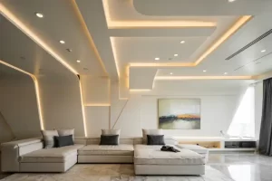
Living Room: Warm and Welcoming
Use warm neutrals, earthy tones, or soft oranges to encourage comfort and conversation. Beige, terracotta, and warm gray work beautifully in spaces where families gather and guests are entertained. Accent with deeper colors like rust or olive for added depth.
Bedroom: Soothing and Serene
Opt for cool, muted tones that promote relaxation. Soft blues, sage green, or dusty lavender create a peaceful atmosphere conducive to sleep. Avoid overly bright or saturated colors, which can interfere with restfulness.
Kitchen: Bright and Energetic
Use cheerful, light-reflecting shades like pale yellow, mint green, or sky blue. These create a clean and invigorating atmosphere for food preparation and casual dining. White or light wood cabinetry can enhance the effect.
Bathroom: Clean and Refreshing
Cool tones like turquoise, seafoam, or crisp white help maintain a feeling of cleanliness and freshness. Add metallic accents or natural materials like bamboo for a spa-like feel.
Home Office: Focused and Motivating
Choose soft blues for focus, greens for mental balance, or even light gray to reduce distraction. If creativity is the goal, consider accents in orange or coral to stimulate innovation.
Creating Color Harmony and Flow
While each room can have its own color story, it’s important to maintain visual continuity throughout your home. Harmonizing colors ensures a smooth transition between spaces and enhances the overall sense of balance and cohesion.
Using Color Palettes and Undertones
Choose a consistent color palette with 3–5 complementary colors. Consider using variations of the same hue with different saturation levels to create depth and consistency. Be mindful of undertones—warm versus cool—which can clash even within the same color family if not chosen carefully.
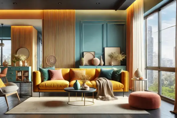
Accent Colors and Focal Points
Accent colors help energize neutral rooms or highlight specific areas. Use them in artwork, pillows, rugs, or a single painted wall. For example, a navy blue sofa in a soft gray room or mustard yellow chairs in an otherwise muted dining area can create striking focal points without overwhelming the design.
The Role of Neutral Colors
Neutrals form the foundation of many interior color schemes. They offer versatility and allow other colors to shine. While often perceived as “safe,” neutrals can still evoke powerful moods depending on their temperature and depth.
Popular Neutrals and Their Effects
- White: Clean, open, and airy. Encourages clarity and minimalism.
- Gray: Sophisticated and calming. Balances both warm and cool tones well.
- Beige: Warm and comforting. A cozy backdrop for natural textures and rustic accents.
- Greige: A blend of gray and beige—modern, subtle, and endlessly adaptable.
Neutrals are perfect for base walls and large surfaces, giving flexibility to change decor with the seasons or your evolving tastes.
Texture, Finish, and Light: Extending Color’s Influence
Color doesn’t exist in isolation—it interacts with surface texture, finish, and lighting. The same hue can look entirely different in matte versus glossy finishes or in natural daylight versus artificial light. These variables significantly affect how colors are perceived and how they influence mood.
Matte vs. Glossy Finishes
Matte finishes offer a softer, more muted appearance and are great for cozy, understated rooms. Glossy or satin finishes reflect light and can make a color appear more vibrant—ideal for small spaces that benefit from brightness and energy.
Natural and Artificial Lighting
South-facing rooms tend to amplify warm tones, while north-facing rooms can make colors appear cooler. Always test paint samples in your room’s actual lighting before committing. Use warm LED bulbs in living spaces and cooler lighting in task-oriented rooms to support mood and function.
Tips for Testing and Choosing the Right Color
Before applying a new color to your walls, test it under different lighting conditions and against the existing furnishings. Paint large swatches on multiple walls and observe how the color shifts throughout the day.
Sample Before You Commit
Use sample pots or peel-and-stick swatches to evaluate colors in context. Viewing the same color next to furniture, artwork, and flooring helps you avoid expensive mistakes and ensures a harmonious match with your interior design.
Consider the Room’s Function
Always return to function. A color that works beautifully in a creative studio might be too stimulating for a bedroom. Let the purpose of the room guide your choice—and don’t be afraid to incorporate personal emotion and memory into your palette.
Conclusion: Designing with Intention Through Color
Color is more than just a decorative element—it’s a powerful design tool that shapes how we experience and interact with our environment. From boosting energy in social areas to promoting calm in personal retreats, every color choice contributes to the emotional and functional identity of your home.
By understanding color psychology and applying it thoughtfully, you can create spaces that not only look beautiful but also support your daily lifestyle, mood, and well-being. Whether you opt for warm hues to foster connection or cool tones to enhance serenity, your palette becomes a silent guide in how your home feels and functions.
Don’t be afraid to experiment with bold accents, layered neutrals, or unexpected combinations. Trust your instincts, observe how colors react with light and furnishings, and let your design choices tell a story that is both personal and intentional.
With a thoughtful approach to color, you can enhance the atmosphere of your home in meaningful and transformative ways—one room, one shade, one feeling at a time.